The Red Thread
The non-linearity of diversification
Correlation analysis in times of market stress

![]()
header.search.error
The Red Thread
Correlation analysis in times of market stress

Correlations between asset classes are not static. Michele Gambera, Fatomata Konteh; and Gianluca Oderda, analyze the relationship between various assets, particularly during times of elevated inflation and market stress, to assess which assets are useful diversifiers and in what scenarios.
Diversification is the beating heart of any multi-asset portfolio. Assets that have low or negative correlation move in different directions and help smooth overall returns; one part of a portfolio offsets and provides ballast against others. Understanding correlations is therefore essential.
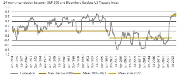
From 1950 to 2000, US Treasuries were positively correlated with equities – only for that to flip negative for the next 20 years. Recently, the relationship has turned positive again.
Figure 1: 2-year correlation between stocks and bonds
A number of questions flow from this. Is there something about the current regime that means historical correlation relationships will continue to break down? If so, what does this mean for asset allocation? And is achieving natural diversification going to get harder?
In the case of the latter, there are many reasons to believe it might be. From rising geopolitical tensions, extreme US debt levels, demographic reversals with structural implications for higher inflation, and the move to a more multi-polar world order (one perhaps less reliant on the US dollar), there are several seismic shifts happening.
Before conjecturing on what this might mean for portfolio diversification and while also acknowledging that the past is not prologue, we crunched the data in search of asset correlations lessons at various stages of the market cycle. The results confirm that the relationship between ’risk assets’ and ’safe assets’ is not linear.1
Non-linear correlations
We analyzed monthly data for a variety of indexes in listed assets between August 1994 and September 2024; for robustness, we also looked at the wider range of index returns at the weekly data frequency, although for a shorter period due to data limitations.2
The following illustration shows the behavior of the asset classes in our sample. The top-left chart, a histogram, shows the distribution of the first asset class (namely, US equities). The chart below it, a scatterplot, shows the returns of US equities (horizontal axis) against developed market equities excluding the US. Clearly, the two indexes tend to move together, with positive correlation. In fact, in the mirror-opposite cell of the matrix, we see r=0.84, meaning that the correlation between the two asset classes is 84%. We organized the charts in two panels, 2a and 2b, for readability.

Figure 2a has plenty of unusual patterns. The bottom line represents gold (vertical axis). Gold seems to have little correlation with the other asset classes, and indeed its scatterplots look like clouds, with no pattern emerging. This suggests that gold prices move independently from returns to the other asset classes, and therefore may be a candidate for diversification.3
The following line is cash. Cash has different regimes, as confirmed by the histogram at the right-hand side of the bottom row. It shows a bimodal distribution – i.e., a histogram where there are two peaks (left for loose money, right for tight money), and a valley (intermediate monetary conditions, which do not appear to have happened frequently in the last 30 years).
The row of charts above cash represents macro hedge funds (alternative strategies focused on macroeconomic themes and taking concentrated bets on specific markets). The purpose of these strategies is to produce returns without material correlation to the markets in the long term and the results imply they do a pretty good job on average.4 The same is true for equity market neutral strategies which buy and sell similar stocks if one is expected to go up and the other down.
With commodities, the left-most scatterplot depicts commodities vs. US equities, showing that when equity markets go down (horizontal axis) commodity prices often seem to dampen the fall. However, observing the scale of the vertical axis as well as the histogram to the right, we notice that more than half of the monthly returns to commodities during our sample period were negative. This suggests that, while commodities are a diversifier, a passive buy-and-hold commodity allocation would have lost money over the last 30 years.
Emerging market debt (EMD) denominated in hard currency is on the following row. The histogram is noticeably narrow, indicating low volatility. The beta of the regression line for the scatterplot in the first column is also positive, showing that EMD returns were positive on average when US equity returns were positive, and vice versa. It is therefore hardly surprising that EMD is seen by the market as a risky asset.

Figure 2b is like 2a in the sense that the first row shows US equities, but the remaining assets are new. Let us look at them, again starting from the bottom row, showing developed government bonds excluding the US, which appear to have little correlation to risk assets. Credit, high-yield and investment-grade bonds specifically, are clearly risk assets with a positive correlation to stocks. US government bonds show a slightly negative correlation to risk assets during the last 30 years, and therefore have worked as mitigators of market volatility.
To complete the chart, we have equities from emerging markets and from developed markets excluding the US, which both have a strong positive correlation to the US stock market, showing the existence of a global business cycle.
Segments of market performance
By segmenting our sample to only consider months where equity performance was particularly negative, we can now look at responses in different market conditions.5

For the chart above, we only consider months in our sample that were in the bottom 2.5% of the distribution – i.e., when the stock market did worse than 97.5% of the cases. All betas are positive except for that of cash, which is negative but close to zero. This indicates that when stocks fell dramatically in the last 30 years or so, cash tended to remain stable. The only other asset class with a small beta is US credit (investment grade) bonds, a relatively safe asset during market panics.6
As Figure 3 shows, both US and non-US government bonds (typically a good refuge during market panics) and hedge funds stand out as these zero-correlation strategies during market routs.
Repeating the exercise with different percentiles offers similar results.7 However, the beta for US government bonds goes from zero to negative. This suggests the hedging effect may be more substantial for government bonds when the stock market fall is less extreme.
The analysis carried out shows clear diversification benefits in multi-asset portfolios.8 However, when stock market losses are severe, correlations between assets do appear to increase, muting the benefits of correlation in a traditional portfolio. Alternative asset classes such as hedge funds may help government bonds in achieving diversification benefits.
Importantly, illiquid asset classes such as direct real estate and private equity were excluded from the analysis. This is because their returns are generally quarterly and based on appraisals rather than on market transactions, making a proper statistical comparison impossible.
Inflation effects
The behavior of asset class correlations in different inflation regimes also matters. Inflation serves as both a barometer of economic health and a catalyst for market dynamics. In particular, we analyzed economic environments characterized by extreme inflation, since ordinary correlation patterns between asset classes are generally expected to break down.
As a proxy for inflation, we used the year-over-year changes of the United States Consumer Price Index for Urban Consumers (without seasonal adjustment and available as a monthly time series). Once again, we segment the data into quartiles.
On the left-hand side, we display the average monthly return of each asset class with its average quadratic error (one standard deviation of the mean). On average, independent of the inflation environment, all asset classes but commodities deliver a positive risk premium over cash.
On the right-hand side, the beta vs. US equities is positive and quite large for most risky assets. Cash and US government bonds represent the exception. Government bonds in foreign currencies display a small, yet slightly positive correlation to US equities, most probably coming from foreign currency risk exposures and global inflation cycles.
Next, we analyze asset class returns in the quantile corresponding to the 10% highest inflation environments – i.e., year-over-year changes of US Urban Consumers CPI higher than 4.13%. In such situations, the picture changes quite dramatically.
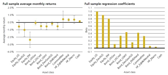
The chart on the left-hand side shows average monthly returns becoming strongly negative for equity indexes. Riskier fixed income assets – such as US credit, US high yield and emerging market hard currency bonds – also show negative average monthly returns. Even ‘safe-haven’ assets, such as US government bonds, provide only a limited degree of diversification as they often have negative returns.
Asset class betas to US equities are again positive and quite large for most risky assets. Interestingly, defensive government bond assets become positive. Therefore, based on the assumption that government bonds should provide diversification to riskier asset classes, traditional multi-asset solutions will most probably encounter performance problems in high inflation environments.
All is not lost, however: Figure 5 clearly shows that cash and alternative asset classes might provide diversification benefits. Average monthly returns are positive for cash, commodities, and two of the hedge fund styles designed to act as ’crisis hedge’ providers.
More specifically, commodities do seem to provide some hedge against inflation, whereas their beta vs. US equities decreases. However, the variability of average monthly return is the highest among all asset classes; the hedge therefore may not be as reliable and the effects on portfolio volatility may not be ideal.
The equity market neutral hedge fund style groups long/short portfolios with little market exposure, aiming to generate return mainly by taking idiosyncratic risk (as explained earlier). The second hedge fund style with diversification potential is the macro style, which groups strategies taking long or short positions in different equity, fixed income, currency and commodity markets, mainly with derivative securities, trying to profit from the economic and political outlook for different regions and countries. These strategies appear to provide good diversification.
The findings already discussed for the 10% highest inflation environment hold true for the 5% and the 2.5% equivalents.9
Volatility effects
Another variable which influences asset class correlations is implied volatility, the volatility used in option pricing models, such as the Black-Scholes model.10 Figure 10 shows the historical distribution of VIX levels.11 We can see that the VIX level distribution is skewed to the right, with historical median at 18.33, and average at 20.06.
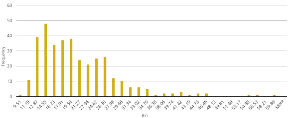
We look at the behavior of asset class correlations in different implied volatility regimes, keeping in mind the results earlier. First, we analyze asset class returns in the quantile corresponding to the 10% highest US equity implied volatility levels.12
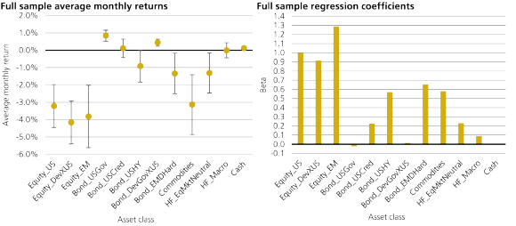
The diversification properties of government bonds continue to hold in high volatility regimes. Conversely, when volatility increases, the betas to US equities of most asset classes increase significantly. The exceptions are cash, US government bonds, foreign government bonds and the macro hedge fund style.
Equity market neutral hedge funds appear to suffer in high volatility regimes, with a sharply increasing beta to US equities. This might happen because certain types of equity market neutral strategies, such as statistical arbitrage strategies, aim to identify pairs of correlated stocks and take opposing positions based on their historical relationship – and in high implied-volatility regimes such relationships tend to break.
When we analyzed asset class returns in the 5% and 2.5% quartiles, the findings already discussed for the 10% highest inflation environment were mostly confirmed.13 However, when implied volatility levels become extreme, even the macro hedge fund style stops providing protection. The only ‘safe havens’ in this situation are cash and government bonds.14
The future of diversification

Past performance is no guarantee of future results, yet past performance is all we can analyze, and it would be illogical not to. Both inflation and implied volatility clearly influence the behavior of asset class correlations, especially during extreme market conditions. Our observations indicate that in environments characterized by high inflation and elevated volatility, diversification – the primary rationale behind multi-asset strategies – is not constant.
‘Safe’ assets such as government bonds and low-beta hedge funds appear to provide diversification against fluctuations in risk assets. However, the extent of this diversification varies.
We can now ask which types of market stress we can expect in 2025 and beyond. Inflation appears to be retreating around the world, so we do not think this will be a likely trigger of volatility (at least in the short term). However, geopolitical tensions in Eastern Europe and the Middle East are a serious concern and so (from an investment point of view) is the high valuation of US mega-caps.
In the past when geopolitical events – such as the tragic 11 September 2001 events occurred – all risk assets such as stocks and high-yield bonds suffered, while ‘safe-haven’ assets such as government bonds outperformed. Even though the September 11 events had roots in the Middle East, commodity prices did not move very much. Meanwhile, in 2022 when Russian invaded Ukraine, risk assets suffered and ‘safe’ assets outperformed, but commodities had the highest gain due to supply concerns.
In terms of US stock valuations, the dot.com bubble (during a period of low inflation) illustrated the effects of a sudden fall from high stock valuations (note we are not suggesting that the current valuations of the largest US stocks is necessarily a bubble). In 2000-2002, after the market turned away from technology stocks, while risk assets lost en masse, traditional ‘safe’ assets such as government bonds performed quite well, providing good diversification.
Therefore, if investors are concerned about geopolitics and the possible overvaluation of stocks, they should consider a diversified allocation to ‘safe’ assets, starting with liquid (such as government bonds) and possibly extending to private assets. For those that fear an explosion in commodity prices due to geopolitics, a commodity exposure may be helpful, with a focus on energy.
Sources:

The art of understanding asset correlations